Rookie Tips: Using a Design Grid
I cannot tell you how many of my Students fail to do this one simple thing. I struggle being patient with other Designers who can’t seem to grasp the simple idea of a Design Grid.
“Always start your design project with a layout grid. No exceptions.”
If you don’t, you’ll never be able to repeat that look consistently. Your projects will never have visual harmony and, like anything which lacks structure or a strong foundation, your concepts will be visually inconsistent from one product to another and will always be a struggle to produce. Without a layout grid, graphic elements will not properly work together. Again, this is more for the Rookies in the world… if you are an experience Designer, you will be able to get the effect you want for each project with or without a grid… but even then you are doing it by CHOICE, not just randomly throwing text into open negative space.
Any high-quality design project, campaign or identity/branding system needs a strong, tested and perfected layout grid system to make it possible to split the work to many designers at one time, so that they all produce the same quality end result with consistency and visual harmony. A layout grid is the invisible force that gives the visible its structure and holds everything in its proper place. Whether you work in web or print, you need to understand how to effectively use grids- even if you think you know better already.
“Grids are kinda like invisible glue.”
They hold a design in a focused way, planned, structured and int the end… things like Proximity, Alignment, Contrast and Repetition is what the human eye craves in a design. The fastest way to get there is a grid based design.
I have been designing for years and years… and I still use a grid almost every time. I may have an ego problem (name a Designer who doesn’t) but I am humble enough to know when I am creating something… it isn’t for ME to like, it’s for the audience.
Take a look at any modern website design.. you will see actual grid-work coming back in a strong way. Hell, modern Designers aren’t even trying to hide the fact that they used grids now (which doesn’t bother me one bit). This has come about as the web has gotten all grown up into a more capable design platform, and web Designers (and Developers… can’t forget those code-writing-sons-of-you-know-what) have created reusable CSS libraries and frameworks to simplify the process of deploying and leveraging grids to create balanced page layouts. Using a grid system up front will help you when you work with the Developers out there too, and it will give them many many less opportunities to butcher your beautiful PSDs.
“Seriously guys… use a damn grid already. Only a filthy casual would think they know how to do it better.”
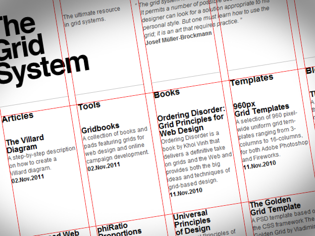
For an entire generation of designers on the web, however, the grid is something of a mystery. While art college graduates will know all about it, for self-taught web designers, there’s much theory and rationalization of the grid as a design tool that simply isn’t covered by the typical blog posts and conference talks. The foremost purpose of a grid (in graphic design at least) is to establish a set of guidelines for how elements should be positioned within a layout.
Oh yeah I nearly forgot to mention that with the onset of Photoshop Creative Cloud there is NO MORE REASON to NOT use a grid. Photoshop will create your columns automagically now (without a freaking plugin… about time, View > New Guide Layout). Don’t be a casual anymore… start using layout grids and watch your designs clean up quickly.