NXGN Business Card Redesign
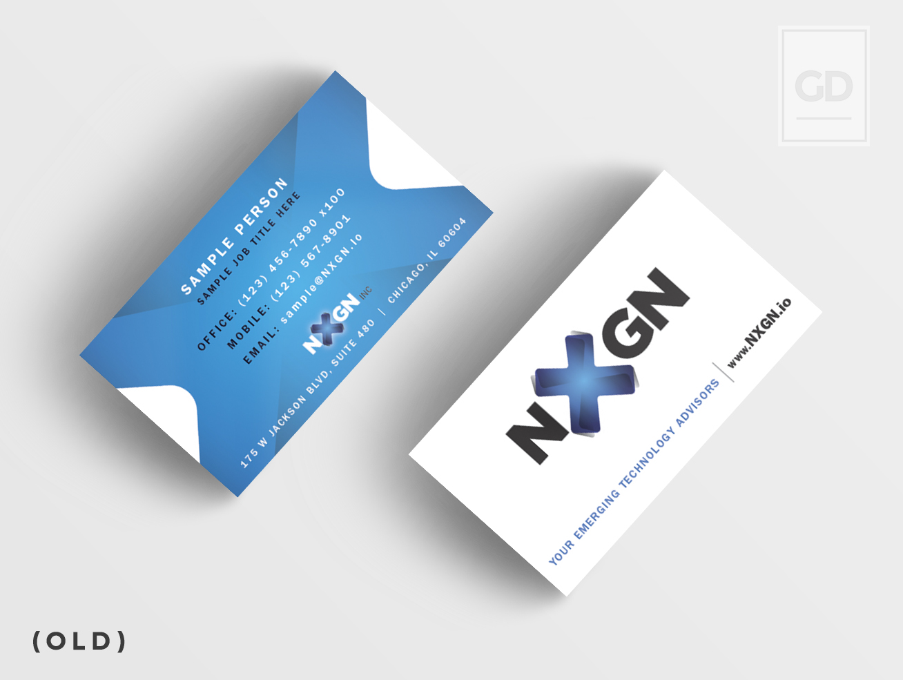
This client needed a branding update, badly. The company is supposed to represent cutting edge technology and cloud solutions, but had a Logo Design and Stationery design that was firmly rooted in the early 2000’s (maybe even earlier). I redesigned the logo for NXGN first, then jumped in to redesign the business card next. I really enjoyed the process of cleaning everything up, and getting rid of the gradient on gradient on gradient thing from the previous versions.
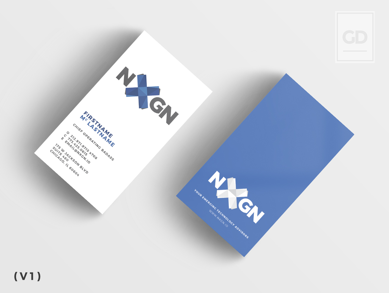
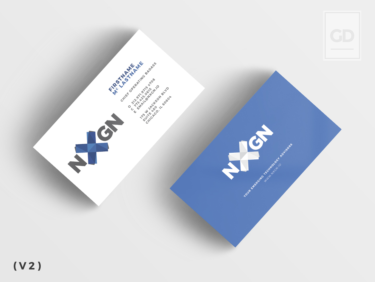
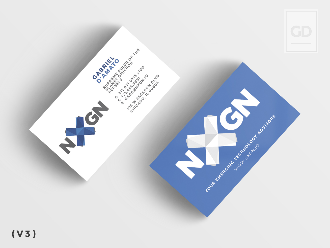
I also turned the card vertical in my first version (1) to give the new logo plenty of clearspace. In the end, the client did not like this change in direction, calling it “too modern”, so a variation of the old card was made to keep a mix of new and old, my version (2). Version 2 as also turned down by the client for the typography being too small in his opinion, and requested the font size to be increased (three times, each bigger than the last) until we arrived on the final version (3).
In my opinion (and against my advice), the typography in the third version was far too big, and destroyed all the beautiful negative space from the vertical design, but the client gets what they want, even if they don’t understand the choice they are making.