Paramount Logo & Business Card
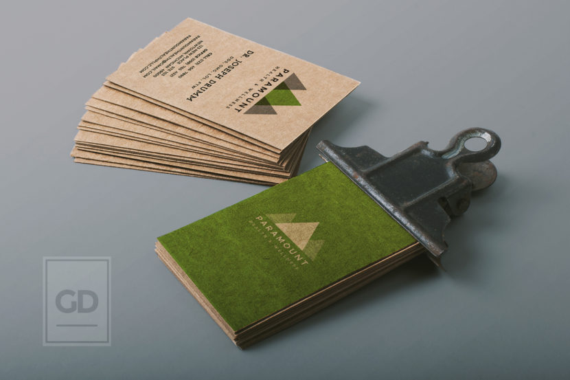
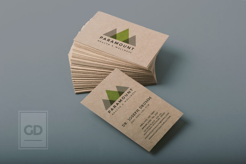
This is the culmination of a fair amount of hours for this client. The simplicity of the logo will be paired against natural and rough textures to bring up a vintage and mature feeling. The color mix of green printed down onto kraft paper business cards has a great impact on the logo, and really makes it stand out.
I can honestly say that the kraft paper design might be one of my favorites ever. I especially like the overprinted green back style.
