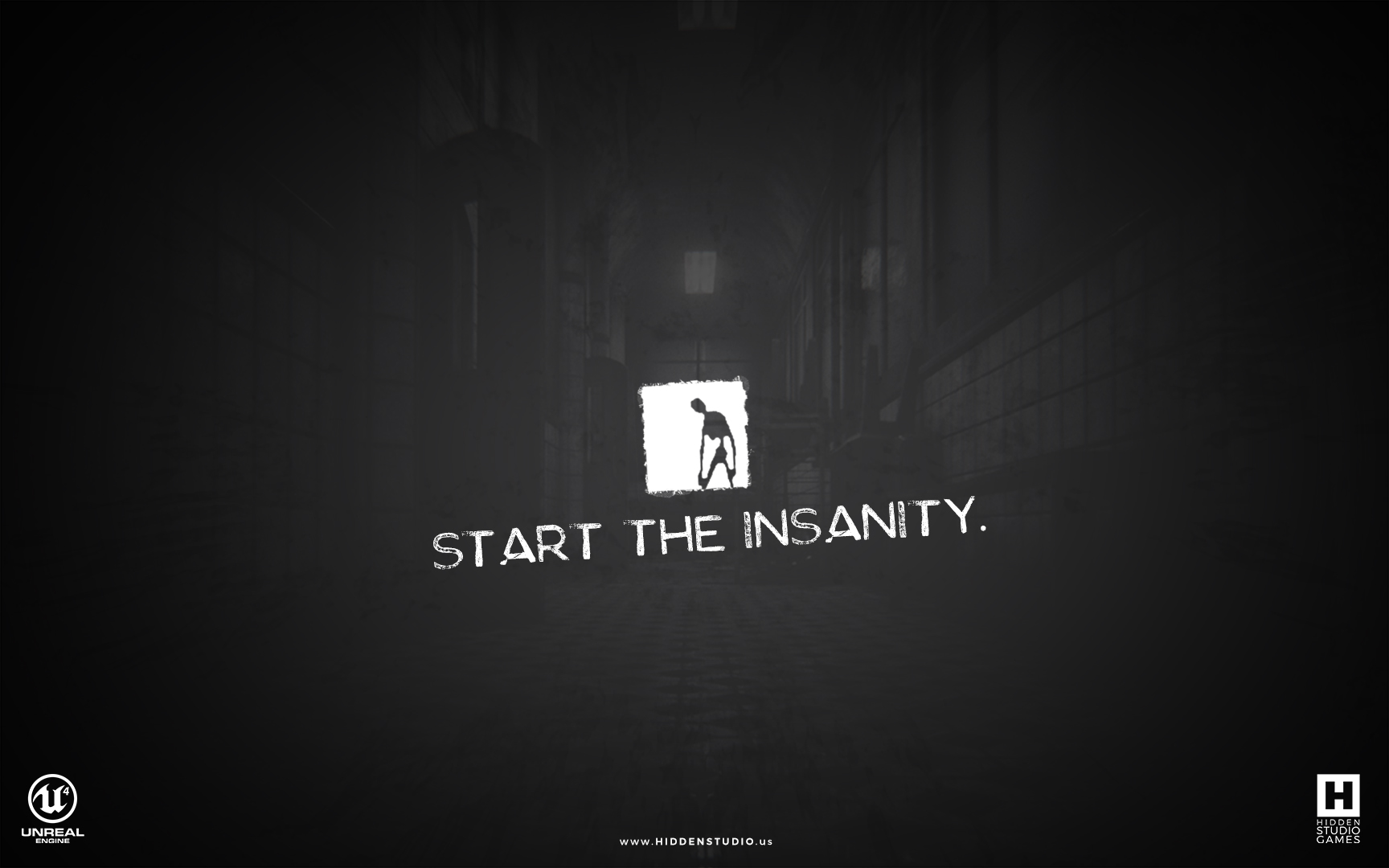
Project: Madfellows Menu Designs
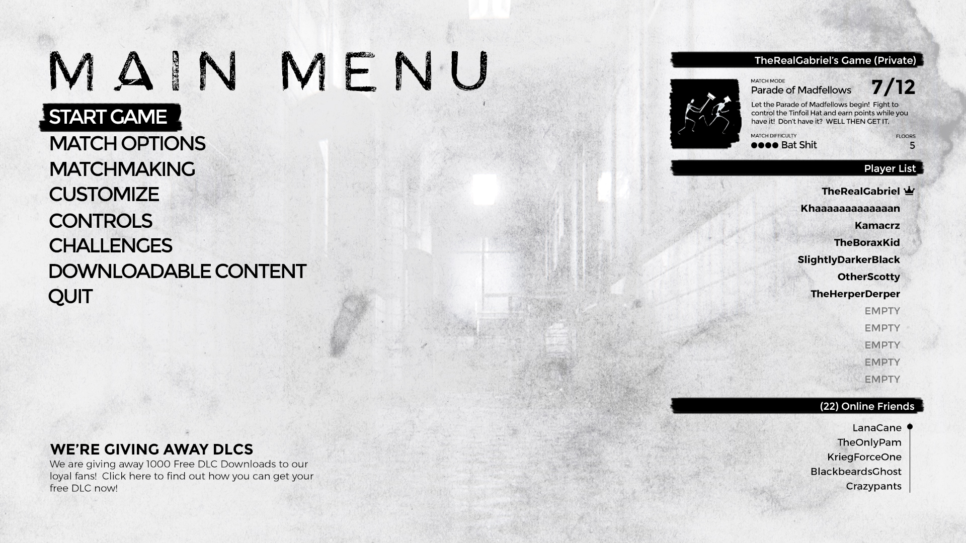
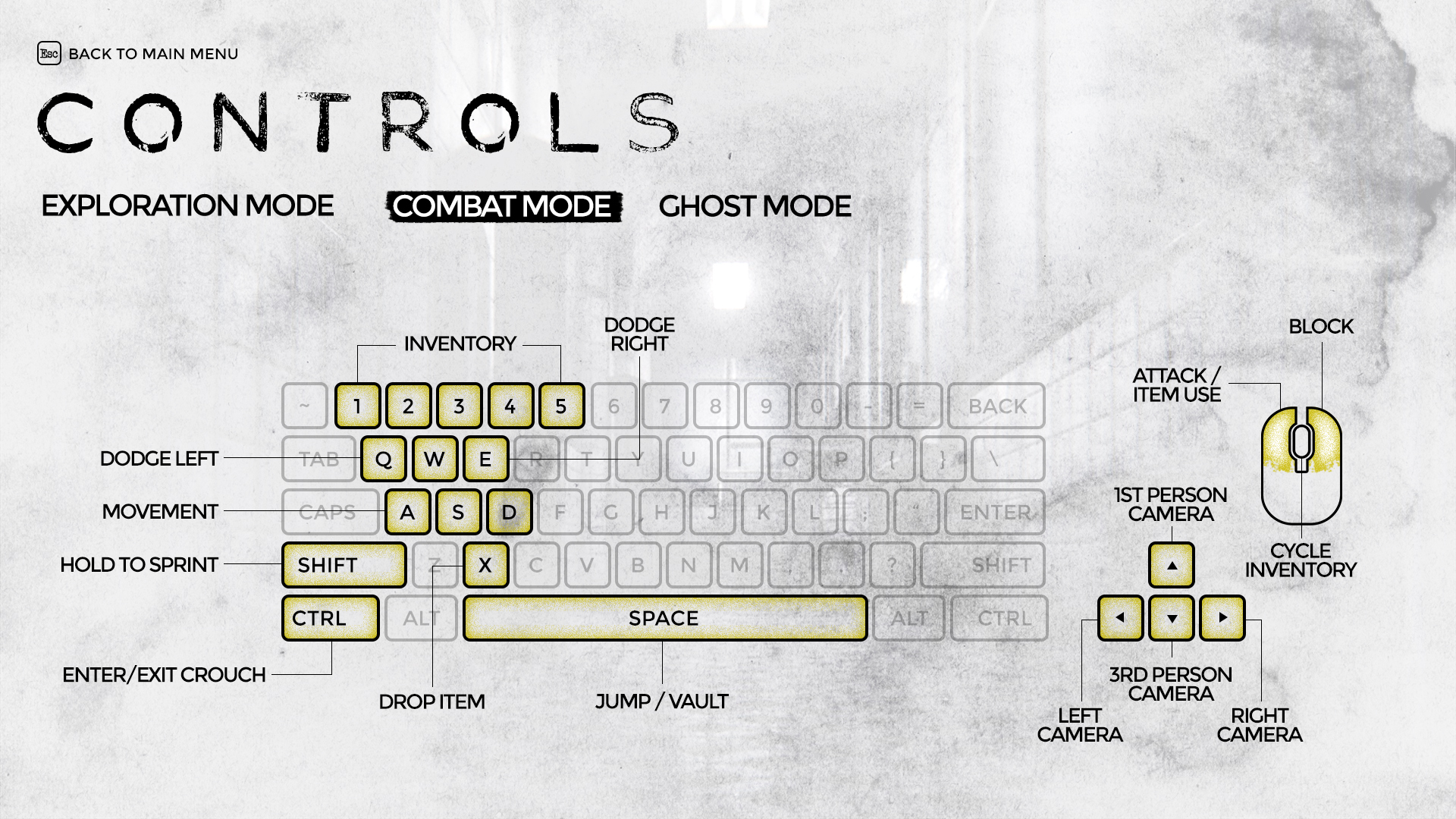
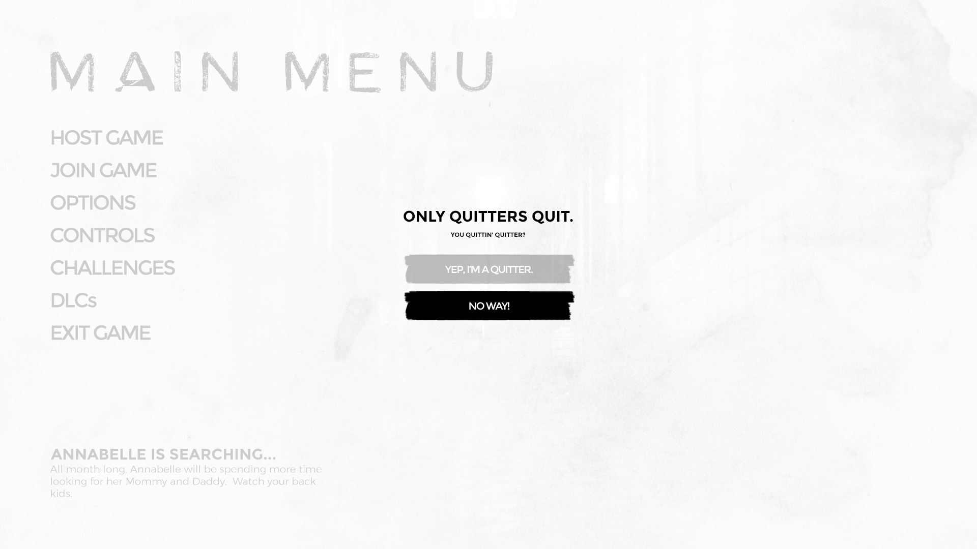
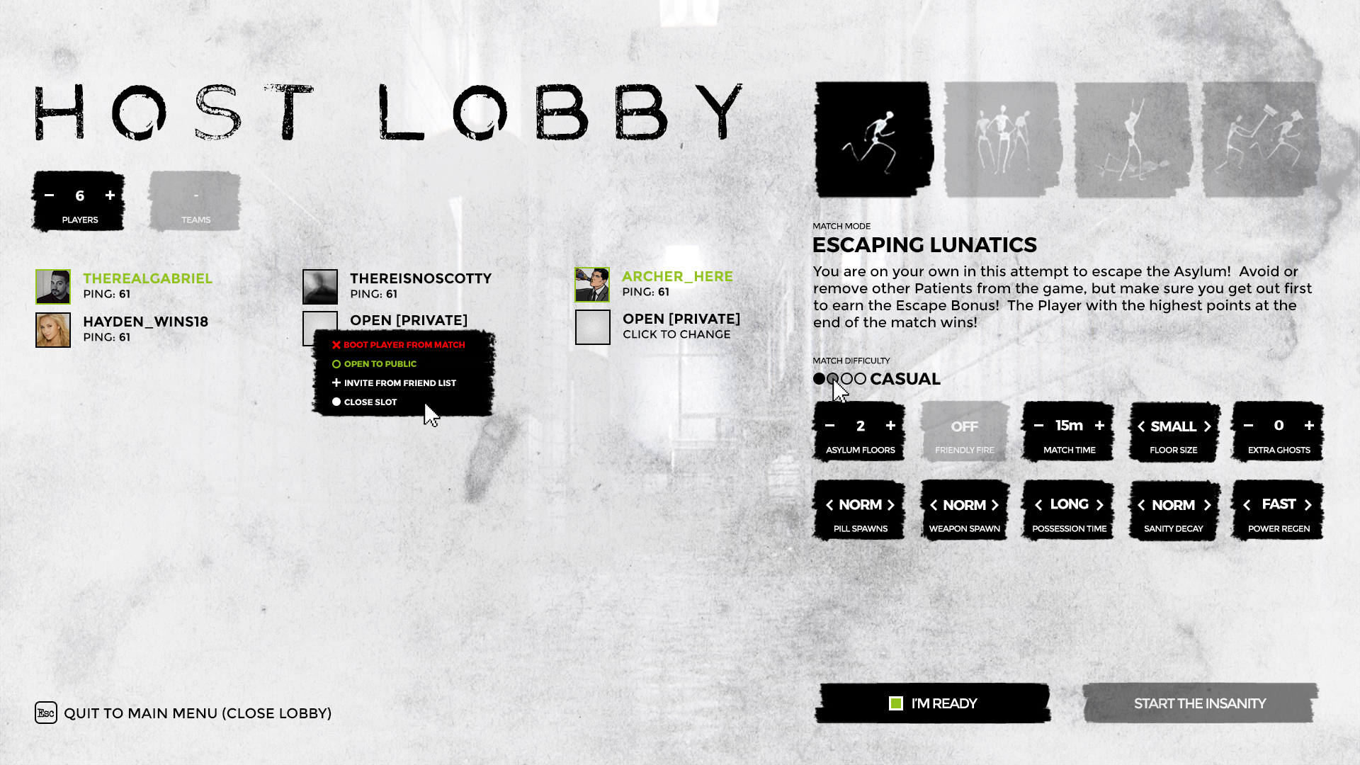
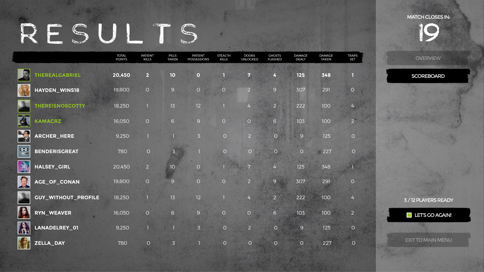
This project required a collection of menus and interfaces that kept the overall ascetic of the game to be in stark contrast with the gloomy and often dark world space the players were in. The menu flow was designed to minimize click count, and highlight where the user could take action in order to make the menu and interface systems as least intrusive to game play as possible. The color choice was a little more work for highlights and attention grabbers, in the end I decided on a bright yellow and reds, which I think plays nice against all the stark black and white.
From the get go, I decided that the contrast should be clean and simple, with thin lines contrasting thick black ones with extreme brightness differences. Finding the right balance was the trick, but once the design starting to fall into place, the remainder of the UI/UX was a breeze.
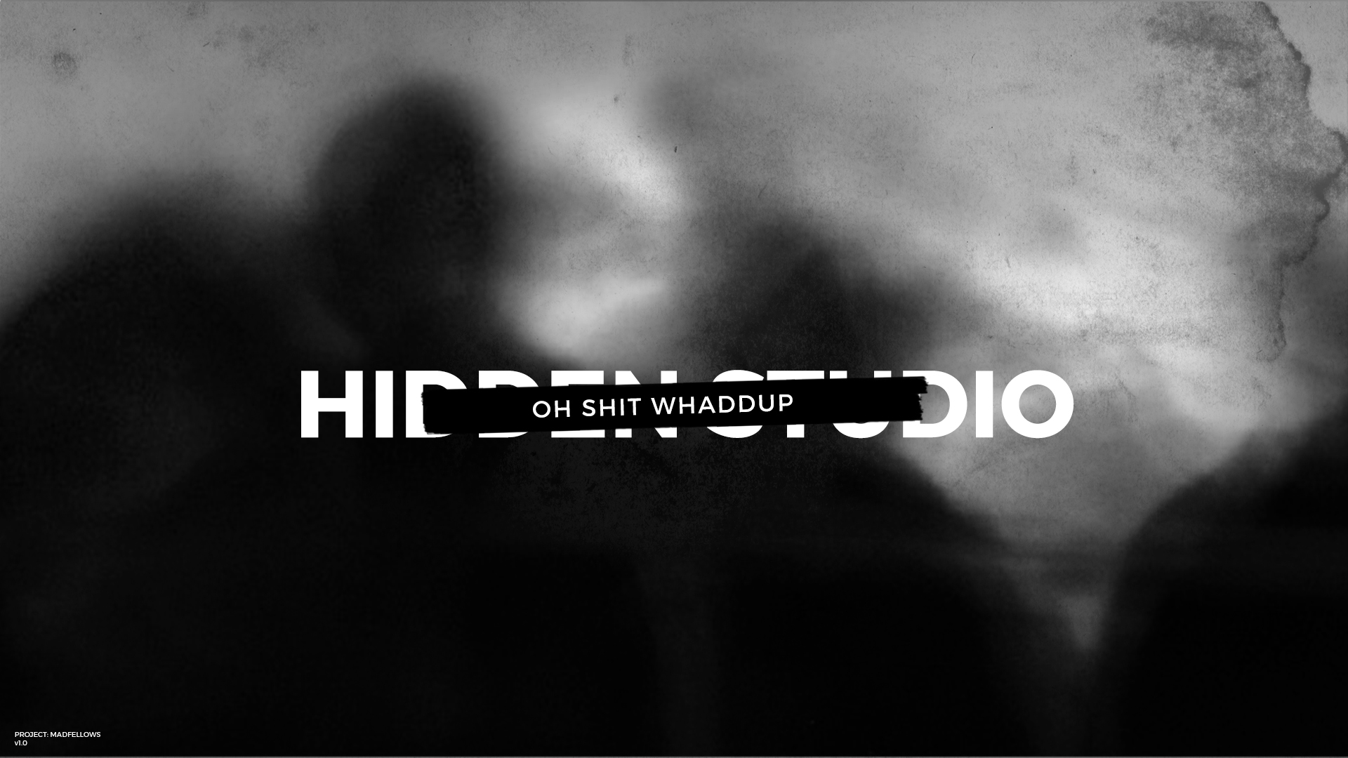
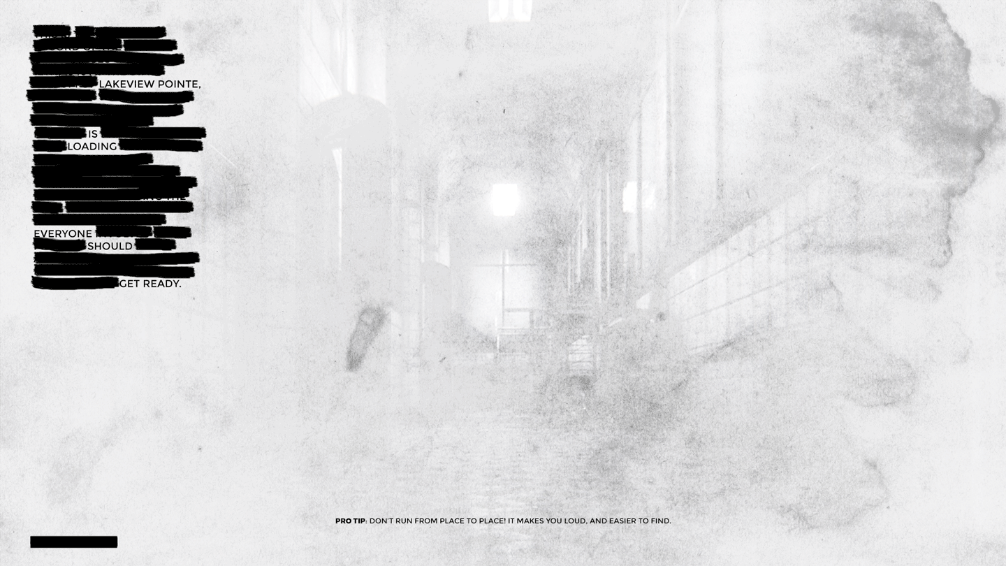
I paid special attention to the transition screens, making sure that as the user went from the bright lobby menus to the dark game world, the eyes would have time to adjust to the new dark environment. The process in-game would be much smoother than the samples shown here.