10 Things to Consider when Making an Online Portfolio
A well crafted design portfolio website is all about self promotion. Whether you know it or not, as a designer (of any kind) you are a brand, and your name is a brand. No one knows or will know who you are until you put yourself out there, especially if you are a web designer (but almost equally true for developers, game designers, print designers, brand developers… the list goes on). It is is of capital importance to have a great portfolio website.
In my years as a Creative Director, I have hired my fair share of people for creative jobs. When a person would hand me their resume, my very first question is usually “Where is your portfolio?”. Some handed me a printed booklet (which is ok too), but my favorites directed me to an online portfolio. Either way… I would flip through their designs while asking them interview questions. The fact is, the INSTANT I see their portfolio, I know right away if I would hire them or not. It didn’t matter how well they answered the questions, or how many certifications they had… I only cared about the portfolio.
So, what was/am I looking for in a design portfolio? I have boiled it down to 10 things that are the most crucial.
#1 The Logo
A persons personal branded logo says so very much about them, and it is usually the first thing seen. In America we read from top to bottom, and left to right. I was never surprised how many people missed the opportunity to put their logo directly on the top left. Sometimes, I would have to scan around to find it, which immediately annoyed me. Not a great way to earn points in an interview. I want to instantly know who made this website, so don’t make me search around to find out. As for the logo itself, it is not required that it is the designers name, but honestly if you are trying to promote yourself online, then I think it should be. I am not interviewing “Epic Win Designs” or “Fancy Graphics”, I am interviewing John Smith. By not using your name as your brand you are essentially removing yourself from your work, and hiding behind some (usually not very creative or waaaaaay too abstract and random) studio name/alias. Also, your logo should always link to your homepage. Not only is it a standard convention for websites, but it is a very easy thing to miss that makes me want to shred your resume.
#2 The “About Me” Section
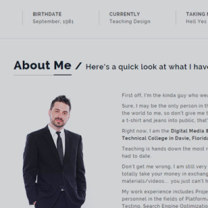
This area is criminally ignored by most designers in my experience. Here you have a chance to really let me get to know you and all you did was list what programs you can use. News Flash: I can teach a monkey to use Photoshop if I really want to, but I am not hiring a monkey. I am hiring a person… a person that I am going to see every day, talk to, collaborate with, learn to trust…etc. This section should be about who you are, so let the world see the man or woman behind the designs. Share where you are from, your design background, how long you have been designing/developing, even what other things you are interested in.
The more information and detail you give to me, the more complete a picture I paint in my mind, which makes for better chances that I can build a bond with you on some level. Unless you are extremely camera shy, put a high-end professional photo of yourself on your site. This gives potential clients/interviewers peace of mind in a way, by allowing us to see who we are dealing with, building more trust. I think it goes without saying that the photo you use should be as clean and professional as possible. Seriously, people… not everyone is into face tattoos and gauge earrings… so think ahead. If that is who you are then so be it, be proud… just understand that you will for sure lose a large section of potential clients/hiring managers simply because they don’t like it.
#3 The Tagline
Once I know who owns this website and is responsible for its design, I will want to know exactly what it is you do. This is where you have a chance to be direct, to-the-point, and even clever. Your tagline should be a short summary of what you do, with a dash of your personality. This trips up a LOT of new designers who don’t exactly know what it is they do, or even veteran designers who now do so many different things that they can’t keep it snappy and quick.
Ask yourself questions like “What am I? A developer? A photographer? A writer?”, and “What do I want to do? Design websites? Develop games? Create brands?”. Take a hard look at yourself and be honest. What are you best at? How do you explain what you do in 10 words or less? Your portfolio’s tagline will change over time also. Keep it up to date if you are freelancing, or working for a studio, or looking for new clients or a new position. Also, know that you are not alone struggling to explain yourself as a designer in a short sentence… we all struggle with this one.
#4 The Portfolio
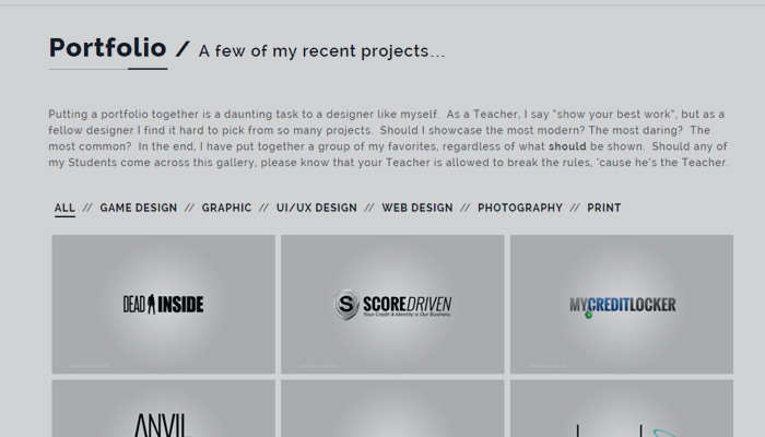
Now that you have a little more about yourself, we come to the elephant in the room… what do you put on your portfolio? After all, the entire website is suppose to showcase your skill as a designer, right? Your portfolio will decide if your entire website is interesting or not, and will single single-handedly either crush or improve your chances of getting hired. People will want to see your previous work to decide for themselves if you have the talent and skill they are looking for… and they want to see a lot of it. Depending on what exactly it is your are showcasing, your portfolio needs to be built of big, beautiful, high-quality images, which can be found quickly and easily. You will want to include a short summary of the project that not only includes the various skills and software needed to complete the task, but that paints a picture of what it was like to work on it. This is another great place you can be yourself a little, letting the viewer get to know you better.
I also want to quickly mention that I can instantly tell if a person is passionate about the work they do just by looking at their galleries online. Most artwork is pretty uninspired, underdeveloped, or flat out boring if the designer is just trying to make a buck. If you don’t believe me, take a trip over to fiverr.com and search for various business cards and logo designs from designers just trying to make a quick buck. If your heart is not into it, why are you doing it? Why should I hire you?
So far as “client testimonials” go, my advice is to skip them. I don’t trust them at all. I have worked for so many different marketing/advertising firms to know how easily these are manipulated, twisted or straight up fake. Some people think they are good, some bad. I leave it to you to make up your own mind on if you want these things on your site.
Lastly… schoolwork in a portfolio is weak sauce. Do not enter that sauce into the county fair, because it is weak. Sure, school is great for learning techniques and shortcuts in all the various design software available, but if you really want to impress someone you should do your own creative work, and do it well. The entire point of a portfolio is to showcase how amazing your skills are by creating things on your own, not class assignments or projects. Again, it comes down to professional passion. If you really want a job in this field you should want to design things on your own, work on your own projects, find your own clients, etc.
#5 The Service List
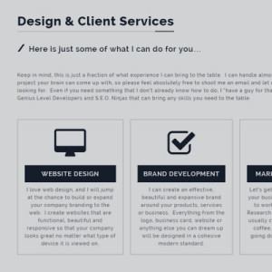
This really applies to the freelancers more than people looking to land a job at a creative agency or design firm. If you are looking to find your own clients and offer your design services to them, ask yourself “What is my best skill? What can I also design that compliments the final product?” Since your tagline summed up your design focus, here you will have a chance to go a little deeper into a list of things you can get done for your clients. You really can’t expect potential clients to GUESS what it is you do just by looking at your portfolio, and you don’t want them to wonder if you can or can’t do what they need, so now is the time to tell them directly. Be clear, and break it down for them. Use very specific terms and words like “Web Design” or “Web Development”, “Branding”, “Wedding Photography”, “Product Photography”, “Business Card Design”. Once you have a list of what you can do, you may even consider getting even more specific (i.e. “Corporate Brand Development” or “Animated Banner Ads).
Another easy mistake to make is to put pricing in your Services. I see people with “Web Design: $999” on portfolios all the time. We all know that this is a super bad idea. This gets me wondering what it is I am getting for this amount, and why its more/less expensive than others in your field. Secondly, you are locking yourself into a price point for a project you haven’t even investigated yet. Someone could contact you for a $999 Website Design, give you a deposit, then be the kind of client who asks for 20 changes a day for the next three weeks. Only now will you realize that you should have charged this client twice as much, as they require twice as many hours. Be very, VERY cautious putting a price tag on ANYTHING, and quite frankly I suggest you avoid it at all costs.
#6 The Blog
A blog is literally one of the best things you can do for yourself either for freelancers or corporate designers. Blog about your specific area of expertise… show the world and the person interviewing you that you know what you are talking about. It will not only help you promote yourself, but it will also keep your website from becoming stale and static, and has the additional bonus of socially attracting other people in your field. Let people follow you by offering an RSS feed (or social click… more on that later), and show of your most popular blogs to new readers by re-categorizing them as “Most Popular”, then putting the most popular ones at the top of the list. Blogging really is your best friend as a designer (after copious amounts of caffeine that is), and will pay you back for the time you put into it.
As far as interactive comments go, this one could go either way. Some people prefer to have active comments on their blogs in order to make sure they can socially engage readers. As a point of warning, there are about a zillion spammers and blog-trollers out there that will gunk up your comments sections if you don’t keep them clean. Personally, I don’t have comments active on my blogs… for a few reasons. (1) I don’t want to have to clean spam. (2) Comments open the door to disagreements, which open the door to nasty internet arguments. (3) They are ugly. (4) If someone wants to contact me I give them many options to do so, like Twitter, Contact Forms, Emails, etc.
#7 The Contact Form
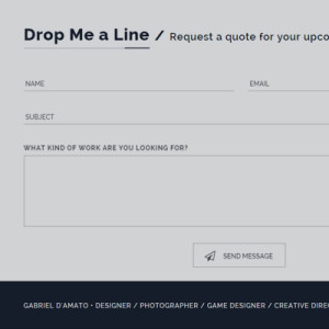
This is one of the more important elements of a design portfolio (even though it’s way down here at 7). While often being ignored or neglected, these are a perfect portal for a potential client to immediately contact you while they are still thinking about you. Think of it like this: They came to your site, they looked around, they liked what they saw, and they want to reach out to you. It is better to have them do so RIGHT NOW while they are still impressed with you. Your contact information should be easy to access and located in a very obvious place. Personally, I put it at the end of my page, near the footer because I want you to see everything I am and have designed recently BEFORE you decide to contact me. Some others would say it should be at the top to increase Click Through Rate (that’s a whole other story, more on that later in #8), so this can go a few ways depending on how you want to approach it. Either way, let the visitor know that they can contact you for a quote or a chat about their project. Use a form (Name, Email, Comment) to make it easy on them. DO NOT make them copy and paste your email into another email manager, that is just poor form.
#8 The Call to Action
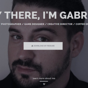
Ask yourself this question: What do you want to get out of your portfolio? Do you want to get hired by a big design firm? Do you want to attract more blog followers? How about get more private clients? Your call to action should clearly state exactly what you want visitors to your site to do. If you use a page design that has multiple pages with standard navigation, you need to make sure that you have a clear call to action ABOVE THE FOLD on every single page. The best way to accomplish this is with a button of some kind that contrasts what is around it, so that it stands out from the rest of the page. Link it to your blog, or resume, portfolio, contact page… whatever you want to use it for. Make sure that button has focus text like “Download My Resume” or “Contact Me”. I know all this information seems straightforward, but you would be surprised to know how many portfolios lack such a basic element.
#9 Professional Language
How you present yourself on your portfolio is of paramount importance. Yes, this may be a PERSONAL portfolio site (so be personal about it), but the people who hire and fire designers expect you to conduct yourself professionally… especially if we are going to hire you onto our teams. There is a great big difference between being super-corporate-boring-branded-bland and a super-opinionated-in-your-face-graphic-designer-genius. Play that grey area by writing all your text in a personal, friendly manner without being over-emotional or underwhelmingly boring. Another trick is to keep your copy concise. Be clear and to the point, and be careful not to ramble on (blogs are different though, so I get to ramble like this). Once you have written all the copy for your portfolio site, re-read it 24 hours later and see if you can cut it down 30% or so. This trick will make sure that you are saying what you need to without the blah blah blah blah that no one wants to read anyways.
#10 The Social Networks
Still, to this very day I am surprised by how many designers aren’t using Social Media. Seems pretty common sense to me? Now that your portfolio has captured the interest of your potential client/interviewer, you should encourage them to follow you on various other websites. Make it clear that they can follow you on Facebook, Flicker, Pinterest, LinkedIn or Twitter (just to name a few of the big dogs in the yard). Some designers feel like they don’t want potential clients to find their “personal” lives online, to which I have the following to say: “If your Social Networks are not professional, then set up some specifically for yourself as a professional”. There are two reasons to do this… (1) You will have ANOTHER opportunity to brand yourself by customizing the various cover images and profiles, and (2) this will allow you to have professional Social Media accounts set up just for you as a designer.
