Forma App Landing Page Concept
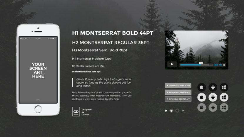
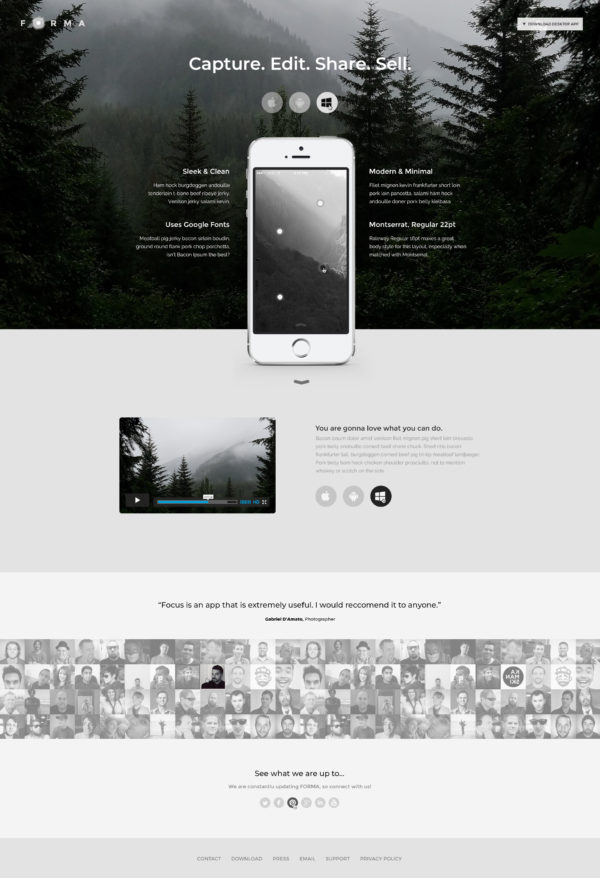
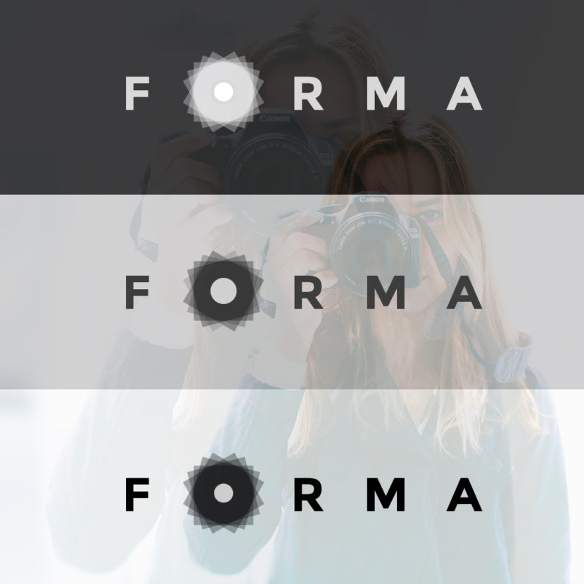
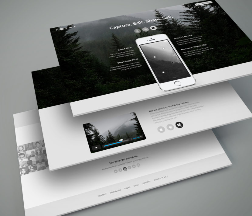
I made this landing page, with a Free Downloadable UI Kit to give my students an example from a class project of Design Briefs. Once I got started, I actually really liked the design of the site. It’s clean, it’s precise and best of all it has simple typography. The site almost built itself once I had designed the logo built around transparency to give it multiple shades depending on the background it’s placed on. I would really love to circle back to this project and produce the actual app template, as well as a branding guide, package designs and swag items like t-shirts and whatnot. Below is a quote from the design brief.
Most of our clients are hobbyist, beginner or moderately experienced designers, who prefer a sleek and modern set of interfaces and branding, but at the same time retain elegance. We have looked around at some logos we like, but are open to suggestions. We really want our branding and designs to be muted and monochromatic to make the actual USER photography stand out.


