NXGN Logo Redesign
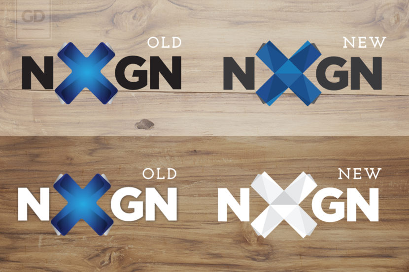
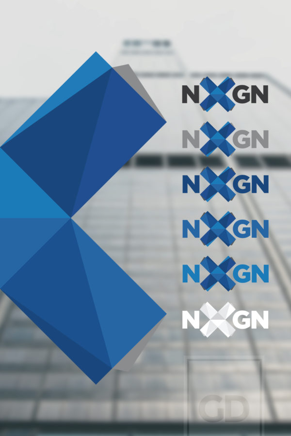
This client hired me to pull them out of the early 90’s and into the next generation with a fresh coat of paint for their logo. The old design featured used of about a hundred gradients, dull rounded corners as well as so many overlapping and blended shades of blue that it really was in need of a modernization. The complete lack of symmetry was instantly visible to me, and the X part of the logo needed love. The owner of the company (an older gentleman FROM the 90’s business world) was very adverse to a drastic change to the logo or his existing branding, so I incorporated all of the same colors and the typography in the updated version. The low poly aesthetic was decided on pretty early in the process, and was meant to be brought into the remainder of the branding through use of iconography, typography and background variations. I redesigned all of the stationery as well, but I will place that in a different portfolio item.
Fixing this logo was a labor of love for modern design We went through about 20 versions before his whole company begged him to settle on this one (it took a fair amount of convincing for some reason). I got rid of all the old drop shadows, oblong X, fixed the kerning, and got rid of all the gradients on gradients and rounded corners.


